From Design Foundations
Fundamentals of Visual Design
Why does a composition feel off?
Foundation / 7 min
After this reading, you can find why a composition feels off by checking hierarchy, grouping, alignment, type and color in turn.
Visual design is not a layer applied after the thinking is complete. It is how relationships become perceivable. Scale signals importance, spacing signals grouping, alignment signals connection and contrast signals difference.
When a composition feels noisy, inspect one variable at a time. Are too many elements competing for emphasis? Does spacing contradict the intended groups? Are type styles creating more levels than the content needs?
Content hierarchy
      ↓
Groups and sequence
      ↓
Type + space + alignment
      ↓
Color and emphasis
A strong system uses few rules consistently. Establish a spacing rhythm, a restrained type scale and a clear primary action. Variation becomes meaningful only when a stable baseline exists.
Hierarchy: decide what matters first
Hierarchy is the order in which a viewer is likely to notice, read and act. It begins with content, not styling: before choosing sizes, decide what someone must see first, what supports it and what can wait. A poster for a college event might lead with the event name, follow with the date and place, and leave the organizer’s details for last. If the organizer’s logo is the largest element, the composition is answering a question nobody asked.
| Property | How it creates emphasis | Common failure |
|---|---|---|
| Scale | Larger elements tend to be noticed earlier and read as more important | Many elements enlarged at once, so none leads |
| Weight and value | Heavier strokes and darker values stand out against lighter surroundings | Bold used for every label until it no longer signals anything |
| Color and contrast | A distinct hue or strong contrast draws attention to one area | Several saturated colors competing for the same attention |
| Position | Placement at the start of the reading path or near the visual center is seen early | Key information placed where the eye arrives last |
| Space | Isolation around an element gives it importance | Crowding the most important element among details |
A quick test is to squint at the composition, or view it at a small size. The shapes that remain visible are the ones carrying the hierarchy. If they are not the elements you intended to lead, adjust one property at a time and look again.
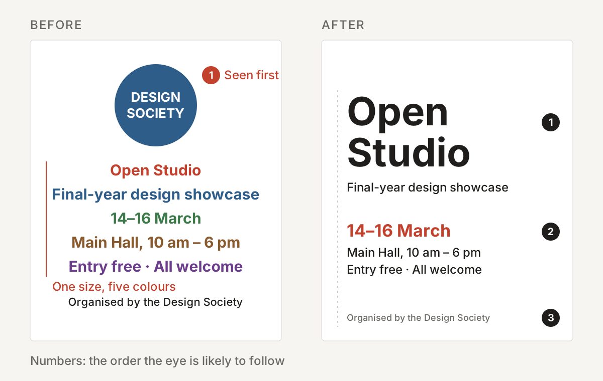
Grouping: let space and similarity carry meaning
People do not see a page as a collection of separate marks. They perceive groups, edges and figures. The Gestalt principles, first described by psychologists in the early twentieth century, name some of the patterns behind that perception. They are tendencies rather than laws, but they explain why the same elements can feel organized or confusing depending on their arrangement.
| Principle | What people tend to perceive | Design use |
|---|---|---|
| Proximity | Elements close together belong together | Keep a label nearer to its own field than to the next one |
| Similarity | Elements that share shape, color or size are related | Give every action of the same kind the same treatment |
| Continuity | The eye follows lines and implied paths | Align elements so a sequence reads in one direction |
| Closure | Incomplete shapes are completed by the viewer | Suggest boundaries with space instead of drawing every border |
| Figure and ground | One area is read as the object, the rest as background | Ensure the subject separates clearly from its surroundings |
Spacing is the most common source of a composition that feels slightly off. When the space between groups is similar to the space within them, the groups dissolve. Choose a small set of spacing values—for example, a base unit and its multiples—and use larger gaps between groups than within them.
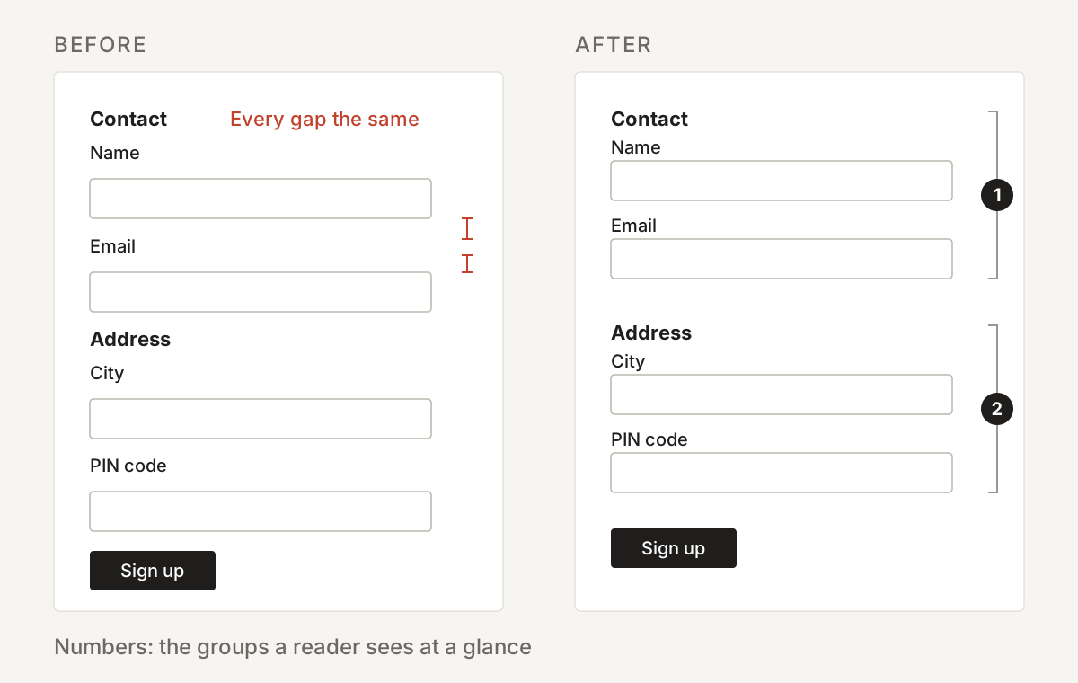
Alignment and grids: create a stable baseline
Alignment connects elements that are not next to each other. When the edges of text, images and shapes line up, the viewer reads them as part of one system; when edges almost line up, the near miss can look like an error. A grid makes those decisions repeatable by dividing the space into columns, margins and gutters before content is placed.
- Align to a few strong edges rather than centering every element independently.
- Keep margins consistent so the composition has a clear boundary.
- Break the grid deliberately, for one element that needs emphasis, not by accident.
- Check alignment by drawing guides over the work; visual estimates are often wrong.
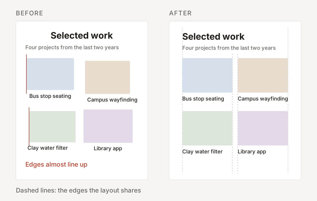
Typography: fewer levels, clearer reading
Type carries both content and structure. Each distinct style—a combination of typeface, size, weight and spacing—adds a level to the hierarchy. Most compositions need only three or four: a heading, a subheading or label, body text and perhaps a caption. When a layout uses more styles than its content has levels, readers have to work out which differences are meaningful.
| Decision | What it affects | A useful starting point |
|---|---|---|
| Number of typefaces | Consistency and character | One family, or two with clearly different roles |
| Size steps | How easily levels can be told apart | A few sizes with noticeable jumps between them |
| Line length | Reading comfort in longer text | Roughly 45 to 75 characters per line for body text |
| Line spacing | How easily the eye returns to the next line | More space for long lines and small sizes |
| Alignment | The shape and rhythm of text blocks | Left-aligned text for most reading; centering for short lines only |
Color: value first, then hue
Color is often chosen first and judged last. A more reliable order is to establish the composition in gray, using light and dark values to create hierarchy and separation, and then introduce hue. If a design only works because two elements are different colors, it will fail for viewers who cannot distinguish those colors, in poor light or when printed in black and white.
- Use a limited palette, with one accent reserved for what deserves the most attention.
- Check contrast between text and background. For web content, WCAG asks for a contrast ratio of at least 4.5:1 for normal text.
- Do not rely on color alone to carry meaning; pair it with a label, icon, shape or position.
- Consider context: the same color can carry different cultural, brand or emotional associations.
Diagnose a composition that feels off
The feeling that something is slightly wrong is useful information, but it needs to be translated into a specific cause before it can be fixed. Work through the structure in the same order it was built, and change one variable at a time so you can see which change made the difference.
| Ask | If the answer is no | Try |
|---|---|---|
| Is it clear what should be seen first? | Emphasis is spread across too many elements | Reduce emphasis everywhere except the lead element |
| Do the groups match the content’s structure? | Spacing contradicts the intended relationships | Increase space between groups and reduce it within them |
| Do edges line up? | Near misses make the layout look unsteady | Align to a grid or a few strong edges |
| Are there only as many type styles as levels? | Readers must decode unnecessary differences | Merge styles that do the same job |
| Does it work in grayscale? | Hierarchy depends on hue alone | Adjust values, then reintroduce color |
| Does every exception have a reason? | Variations look accidental | Remove the exception or make it deliberate and consistent |
These principles also appear in entrance examinations. CEED 2027 Part B, for example, includes questions on form sensitivity and visual sensitivity alongside sketching and creativity. Practicing the audit on your own work, on posters around you and on past responses builds the habit of explaining a visual judgment rather than only feeling it.
Visual design becomes easier to learn when it is treated as a set of decisions rather than a talent. Each decision—what leads, what belongs together, what lines up, what repeats—can be named, tested and revised. A composition feels clear when those decisions agree with one another and with the content they serve.
Takeaway